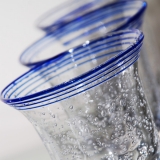
A few weeks ago I was telling you about the project I was doing at college. I haven’t quite finished it yet but I thought I would show you what I’ve got so far. The objective was to produce a set of six photographs investigating how the frame can be used to create compositions of shape, line and pattern. The final images should show differences in subject distance, consider the rule of thirds, demonstrate creative use of line, make use of different vantage points and show that the background had been taken into consideration.
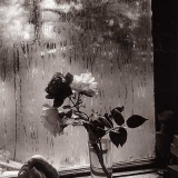
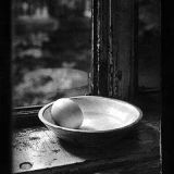
The three categories available to choose from was Patterns in Nature, Rhythms of Life and Urban Patterns. I chose the second one, as I decided my theme was going to be still life. With an idea already in mind, I started researching a few other photographers for inspiration and I was fascinated by the work of Josef Sudek, a Czech photographer.
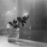
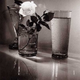
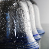
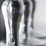
I wanted my project to have a fragile sort of feel to it, so I chose to photograph a few beautiful wine glasses on a glass table in my living room. I pushed the table into a corner so I would have the eggshell-coloured wall behind it as a background, to make the pictures look as clean as possible without any disturbing clutter. I bounced my flash off the wall as well to not get any harsh shadows. I used a wide aperture to softly blur the background out of focus.
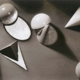
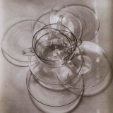
I still haven’t chosen the last two images but I think I’ll do another session tomorrow to get some more shots. I’ve got over a hundred to choose from already but I feel that I want to give it one more try with the camera before I make up my mind. This project along with some of the following photos by Josef Sudek will go in my sketchbook/portfolio that I’m putting together for this course.
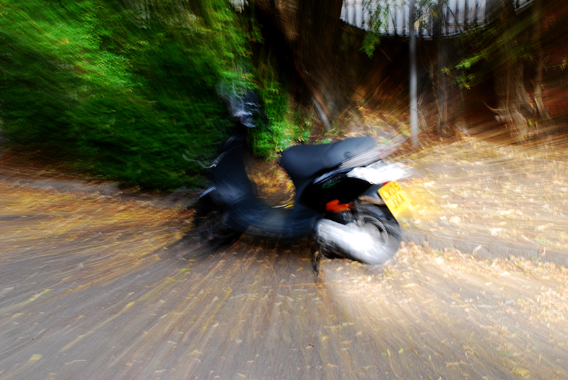
Today we did a few exercises with panning and zooming combined with slow shutter speed. It was so much fun but it was a bit too bright outside for the panning part, so I’ve got nothing particularly good to show from that. The assignment was to follow a passing car with the camera to try and freeze the car while the background was still consisting of motion blur. The zooming part was slightly more successful, so here’s an example of what I ended up with.
